
Every escalation caught before it costs a customer.
A live operations console that gives call center shift managers one workspace to monitor their floor, guide agents through critical calls, and act before sentiment turns to complaint.
A call center shift manager monitors a live floor of dozens of agents and hundreds of calls. The tools available show data. None of them tell the manager where to look, who to help, or how to act in the next thirty seconds.
The floor was always moving. The interface was always behind it.
Design a single desktop workspace where severity and sentiment are the loudest signals, live metrics are always visible, and the manager can guide any agent in the room without leaving the dashboard or asking anyone to stop their call.
Outcomes & process
Shadow the floor
We observed shift managers through live sessions to map how they scan, decide and intervene during a high-pressure shift.
Reframe to severity
We reframed the dashboard from "show all calls" to "surface what needs action," letting severity and sentiment drive visual weight.
Design in lockstep
Parallel design tracks for the metrics strip, calls list and guidance panel, each validated against real floor scenarios.
Systematise
A component library and alert-pattern language documented for engineering and extensible across the broader Verint product suite.
One look tells you
the lab's state
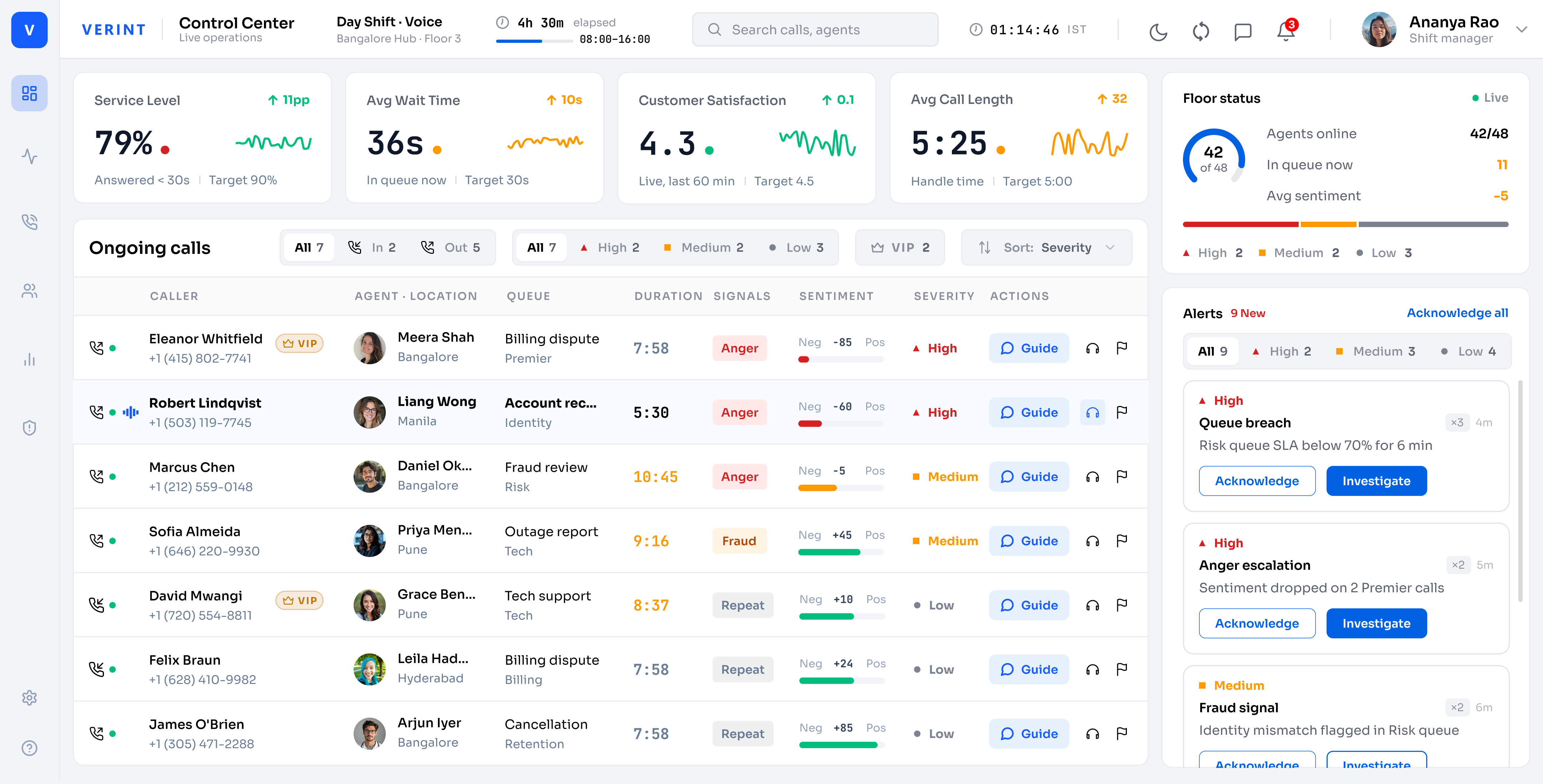
The dashboard surfaces service level, wait time, customer satisfaction and call length in a persistent header strip with live sparklines and delta indicators — no clicking required.
Triage the whole run at a glance
Every ongoing call shows caller, agent, queue, duration, sentiment signal, severity rating and a one-click Guide action. The list sorts by severity by default so the top row is always the most urgent.
42 of 48 agents online, at a glance
The floor status panel shows agents online vs. total, queue depth, and an avg sentiment score with a severity breakdown bar, so the manager sees the health of the whole shift in one number.
More data, less noise
Visual density is the product. Color is used only for severity and sentiment signals. Type size carries hierarchy. Every element earns its space on a screen that never gets a second glance during a live escalation.
The floor was full of signals. The problem was never a lack of data. The problem was a lack of hierarchy to tell the manager which signal, right now, needed a human decision.
Signal
Severity and sentiment are the loudest visual signals on screen. Everything else recedes until it is needed.
Speed
Guide, listen, mark — the most frequent actions are one click from the calls list. Nothing requires navigation away from the floor.
Trust
AI-generated nudges are contextual suggestions, not commands. The manager chooses, the agent acts, and the customer never knows.
Inside the Control Center
Two views, one workspace. Step through the screens a shift manager moves between during a live floor session.
Live floor overview: four KPI metrics, ongoing calls sorted by severity, floor status and real-time alerts in one view.
The full dashboard: KPI metrics strip, ongoing calls list with sentiment and severity signals, floor status donut, and a live alerts panel with acknowledgement controls — all in one viewport.
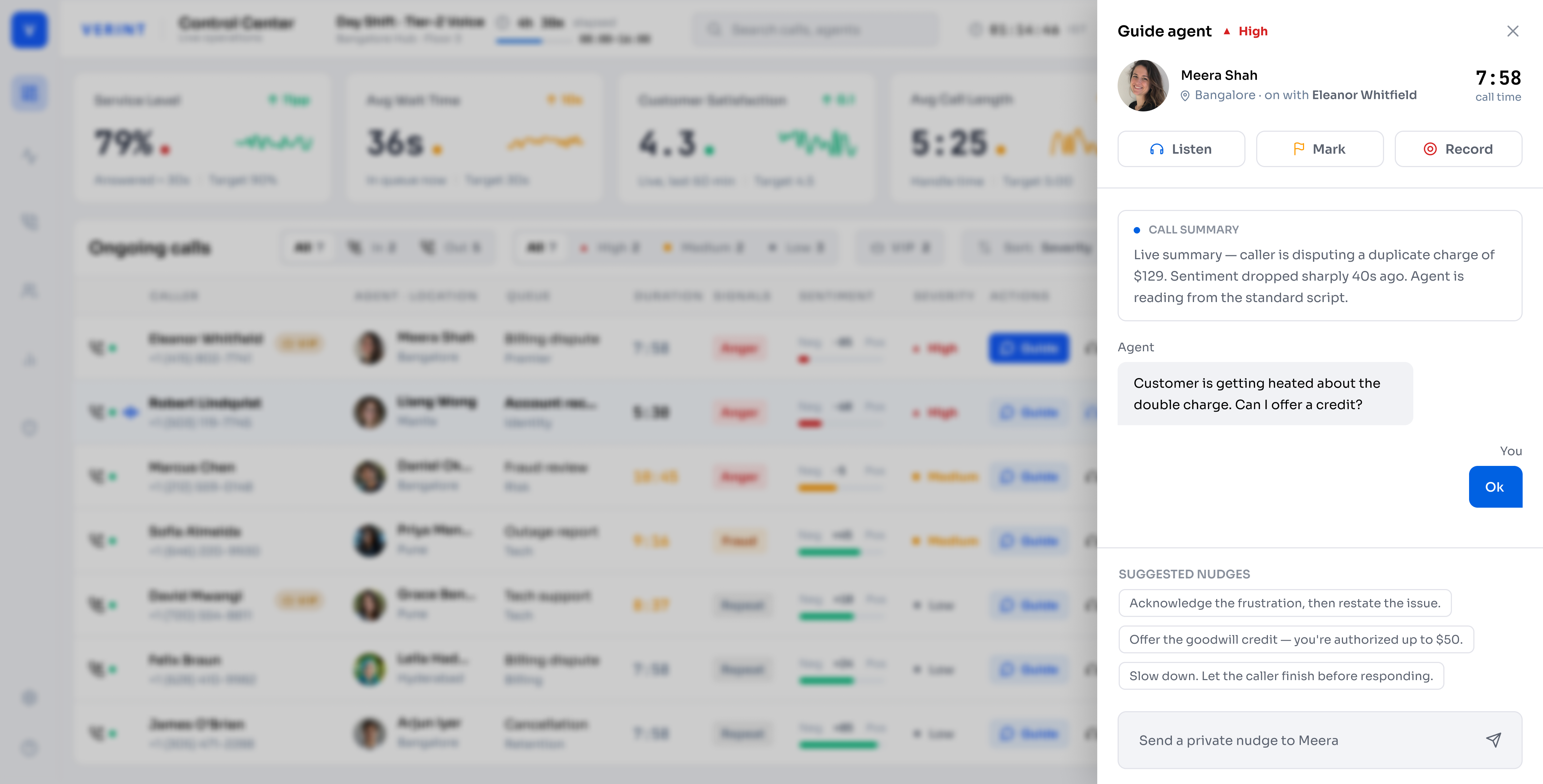
The Guide panel: a live AI-generated call summary, a private manager-to-agent chat thread, and suggested nudges derived from the real-time conversation — active in under three seconds from any row in the calls list.
The foundations behind the console
Colour, type, iconography and status patterns — built to feel like part of a broader Verint product suite, not a standalone exercise.
Dark navy canvas for low eye-fatigue on long shifts. White cards for surface separation. Red, amber and grey reserved exclusively for severity — never decorative.
Inter for data-dense UI chrome. Weight carries hierarchy — regular for data rows, medium for labels, semibold for actions.
16px stroke icons, 1.5px weight, round caps. Every glyph maps to an action or status type the manager already knows from their workflow — no decorative icons.
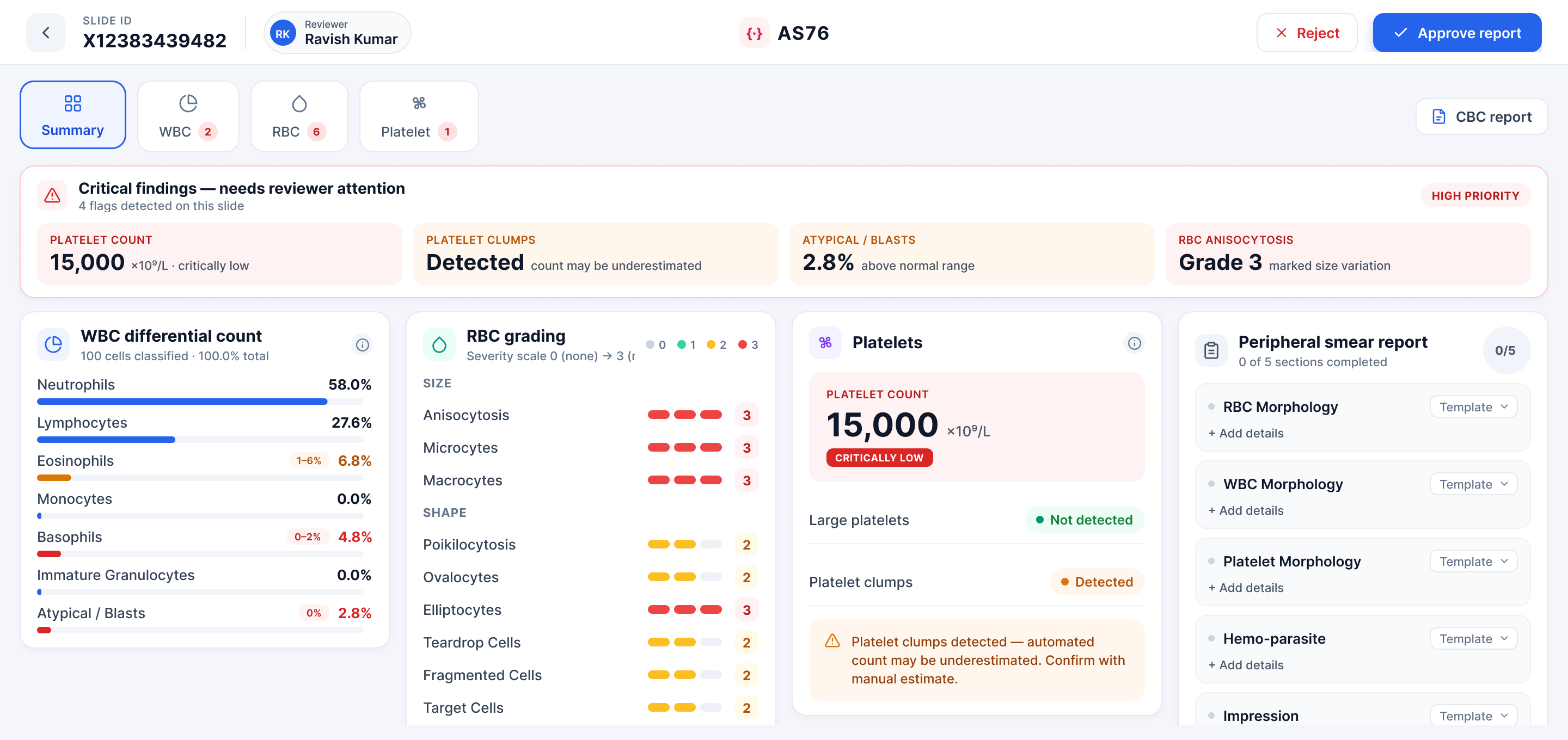
Every smear, reviewed in minutes.
 ↗
↗